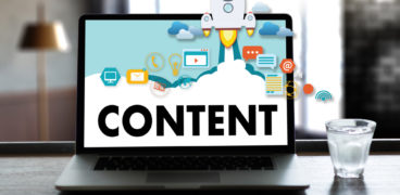
getting it all in proportion: imagery for websites

Choosing the right imagery for your website can be a real challenge. Pictures need to reflect – or at least not clash with – the headlines and text that they illustrate. We share our tips for getting your website images right…
why is website imagery important?
Images are becoming increasingly important online. Remember that old adage – a picture says a thousand words. Great imagery gives stories impact, gains users’ attention and even helps people retain information:
When people read information, they’re likely to remember only 10% of that information three days later. However, if a relevant image is paired with that same information, people retain 65% of the information.
Lifelearn.com
where can you find digital imagery?
Most of us don’t have the time, skill or resources to create our own imagery, so online picture libraries are an invaluable tool. There are hundreds of these online offering images free or for a cost, with wide-ranging quality levels.
Sifting your way through large collections of images can be time-consuming and hard work. Not only may you be unsure what type of image you need, but you also have to ‘translate’ what you’re looking for into keywords for the picture library search engines. This can be a challenge as it involves guessing how the photographers and artists (from around the world, so their first language may not be the same as yours) have tagged their images.
the importance of image shape
What picture shapes work well on a website? This depends on your particular website, but web design and technology trends are increasingly favouring certain shapes.
For instance, if you look through WordPress web design themes, you can’t fail to notice a preponderance of wide, low images – the ‘letterbox’ shape. Whilst designers love this shape, the internet is littered with poorly-cropped images where people have tried to squeeze pictures into the ‘letterbox’ formats and failed. Even where the image itself has been cropped effectively, it is often obscured by or loses impact because of text on top.
Of course, there is a reason for the ‘letterbox’ trend of course – in order to fit a top banner, logo, main navigation and homepage ‘hero’ image into a desktop browser window, this is the shape you need. But because of the challenge with letterbox images, it’s often worth paying more for this image or getting a professional designer to help.
Across other website pages, more standard aspect ratios are often used. An aspect ratio of 16:9 (the shape of a HD TV screen) is very common now. These shapes are similar to those coming directly out of cameras, so much easier to crop, edit and use for web design.
responsive design & picture shapes
On smaller screens, both portrait shapes and squares will display larger than landscape shapes if the device is held vertically. Bearing this in mind could change your whole approach to image shapes. The question then becomes – how are most people viewing your site? If you have more desktop users then landscape images will work well, but if you’ve got more tablet and mobile users then squares or portrait shapes might be preferable.
Ultimately, there’s a place for every shape of picture on your website – but they won’t all fit every slot on every page. Finding the right shape and style of image for each page is all part of the exciting process of designing the content for your site.
For on-demand help with web design or content marketing, please get in touch.