the best charity websites (& how to make your charity web design stand out)

We’ve been searching high and low around the internet for the best charity websites. Coming from a user/consumer perspective, we looked at hundreds of charity homepages, and considered which sites are the easiest to navigate, most user-friendly and have the clearest messaging.
We share our seven favourite charity website designs below…
what the best charity websites do
Website users are generally pretty impatient so charity websites need to deliver a clear and engaging message in an instant. Otherwise, they run the risk of losing potential donors/supporters before the site has had a chance to get its case across.
The best sites have compassion for the user – not overloading them with choices or too much text, and instead making calls to action obvious and ensuring that users can easily find further information as needed.
The best charity websites have several things in common:
- They use excellent imagery and graphics to create instant impact
- They have clear calls to action, encouraging users to support of the charity by making a donation, volunteering or signing a petition
- They have informative menu options, making them easy to navigate
- They have compelling stats and/or infographics to show the impact of the charity’s work
- They use a clean and clear design, without too much text
Whilst larger charities obviously have larger budgets and therefore can afford more jazzy designs and functionality, they also often have more projects and strands of work, making it harder to convey their key messages and calls to action.
We believe that great charity website design – including all of the above – is possible regardless of budget. Here are our seven favourite charity websites…
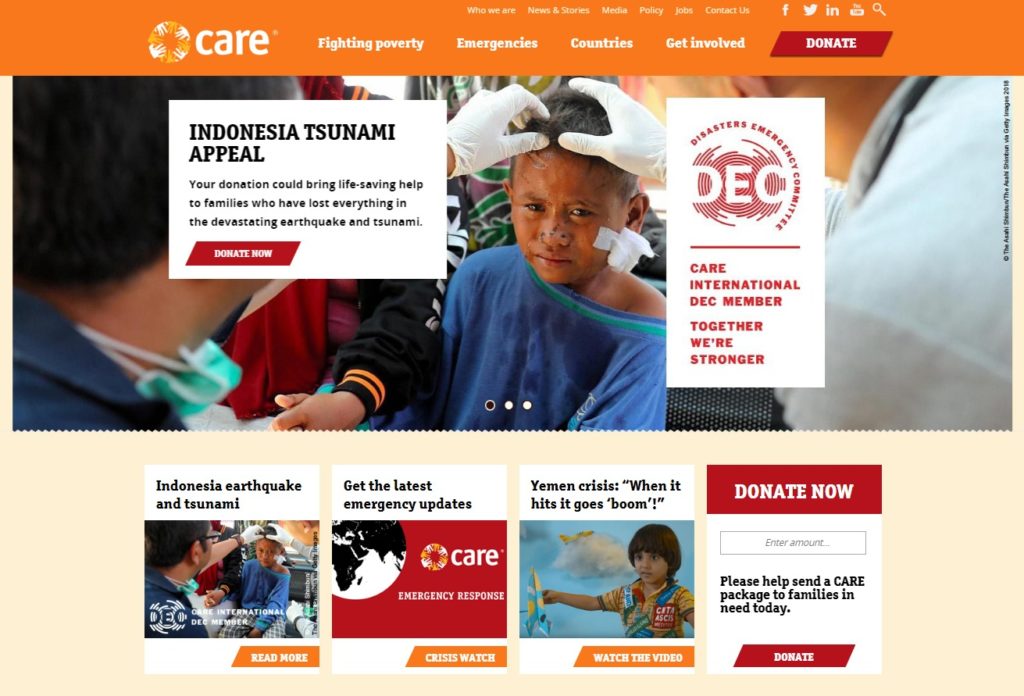
1. Care International
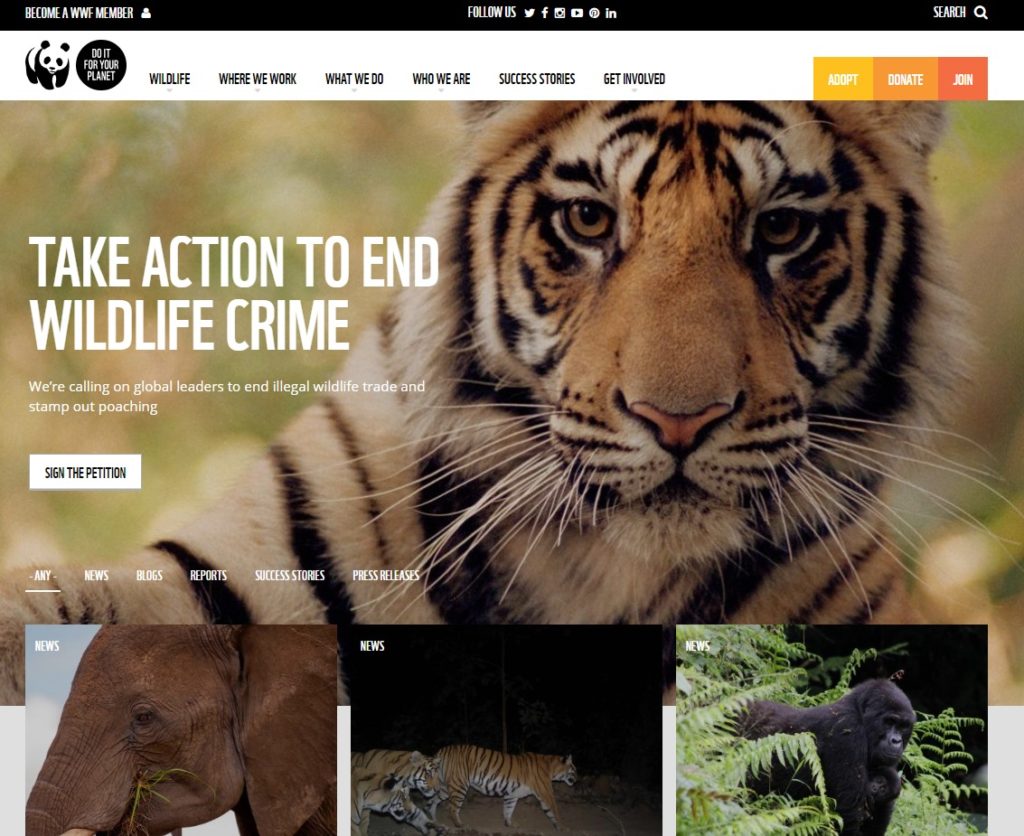
2. WWF
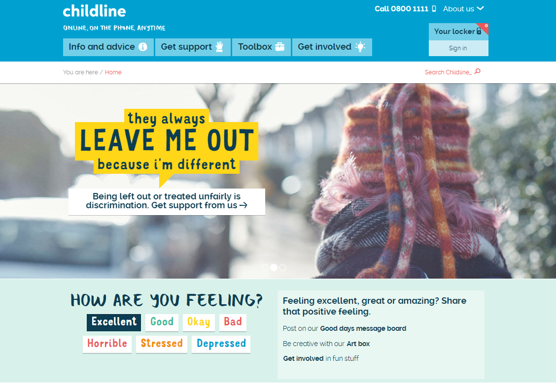
3. Childline
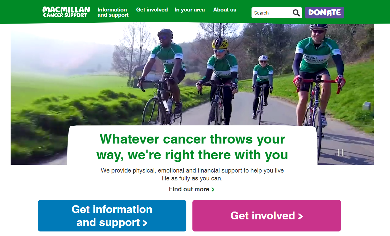
4. Macmillan Cancer
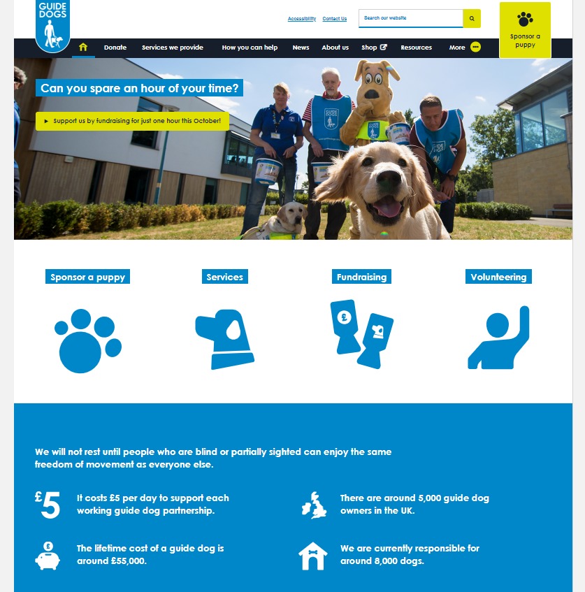
5. Guide Dogs
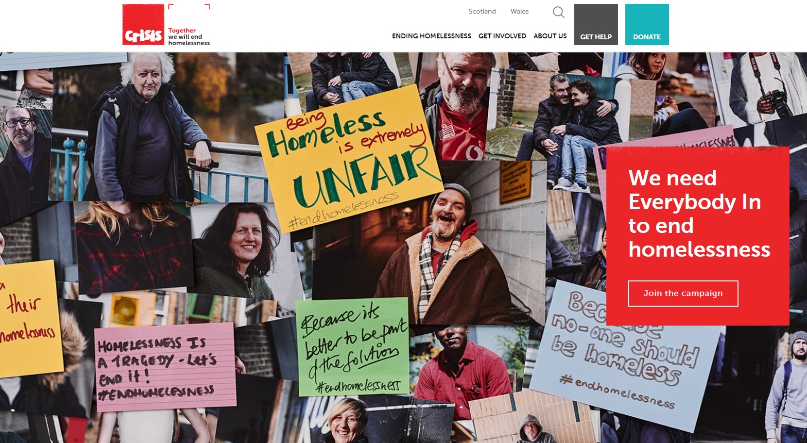
6. Crisis
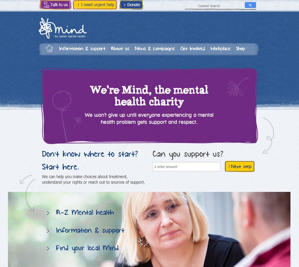
7. Mind
how to improve your charity website design
We recommend these three steps to improve the design of your charity website:
- Think about the user – what do they want to know and what do you need to tell them? Make your messages clear and consise to avoid overwhelming users with too much information.
- Use imagery – ‘a picture paints a thousand words’ as they say, so use great images to represent your charity’s work. If you don’t have your own photos, it may be worth searching online for stock photography.
- Ask for donations/support – it’s important to be bold to ensure users know that you need their donations and other help to make the world a better place. Explain exactly how donations are used and/or what other support is needed, and make any payment or sign-up processes as simple as possible.
need help?
We’ve designed websites for numerous charities and not-for-profit organisations including World Cancer Research Fund, Anti-Slavery International, Care International and The Fostering Network.
We understand the challenges charities face and are passionate about helping you reach your target audiences, increase fundraising conversions, convey key messages and improve user engagement. Get in touch or visit our charity services page for more information.