We’re pleased to announce the launch of a new website for Avillion, a global bio-pharma company.
Avillion helps its pharmaceutical and biotech partners bring more life-saving drugs to the market by providing funding, speed of execution, quality data and results.
Previously, the company had a dated site which wasn’t conveying their brand effectively. We set out to create a new website that would match the company’s abilities and portray its forward-thinking and global nature. Our fresh and modern design is built in WordPress and is fully responsive.
“Pedalo was a great company to work with and we’re very happy with the finished product. We now have a much more informative and competitive website within the industry. The design and layout is clean and easy to navigate. Pedalo was very helpful and responsive throughout the build process and helped accommodate our requirements and worked with us towards our deadlines. We’ve had some great feedback about the new website and it’s a huge improvement on what we had previously.” – Avillion
Reducing cognitive overload is a key factor in user experience design. Google has been doing it for years, with its minimalist but extremely effective homepage. And whilst this type of design looks simple, often a lot more thought is required than for complex webpages. It’s all about distilling the website’s essence down to one or two key functions.
Then, when it comes to the actual UX design, there needs to be various invisible features included to make the user journey seamless and the simple design work so well. We’ve put together a list of our seven favourite invisible UX features which provide an optimised user journey and enjoyable browsing experience:
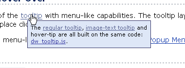
1. tooltips
Tooltips are text labels that are invisible until a user hovers over a certain word or phrase. They then appear and provide useful information or suggest further reading and assistance.
2. hidden next steps
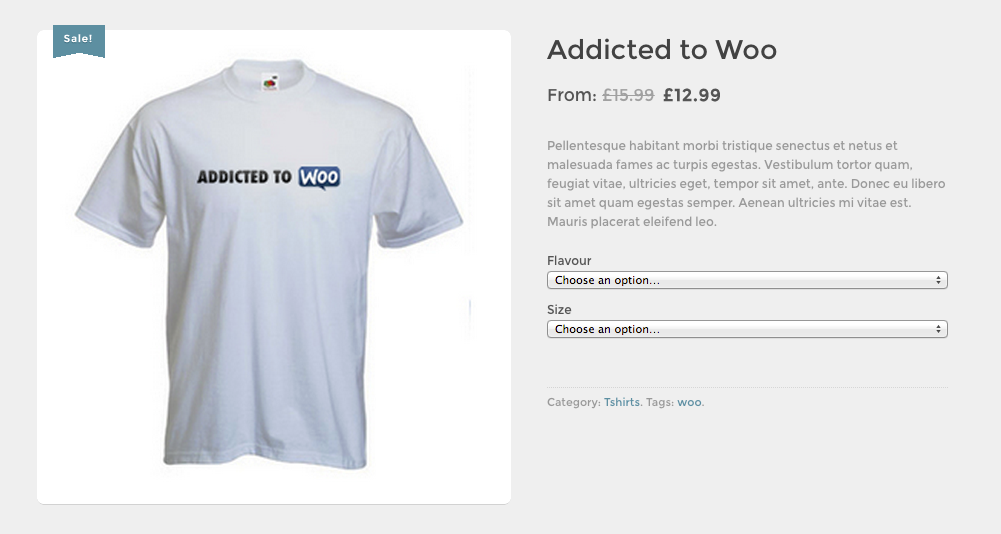
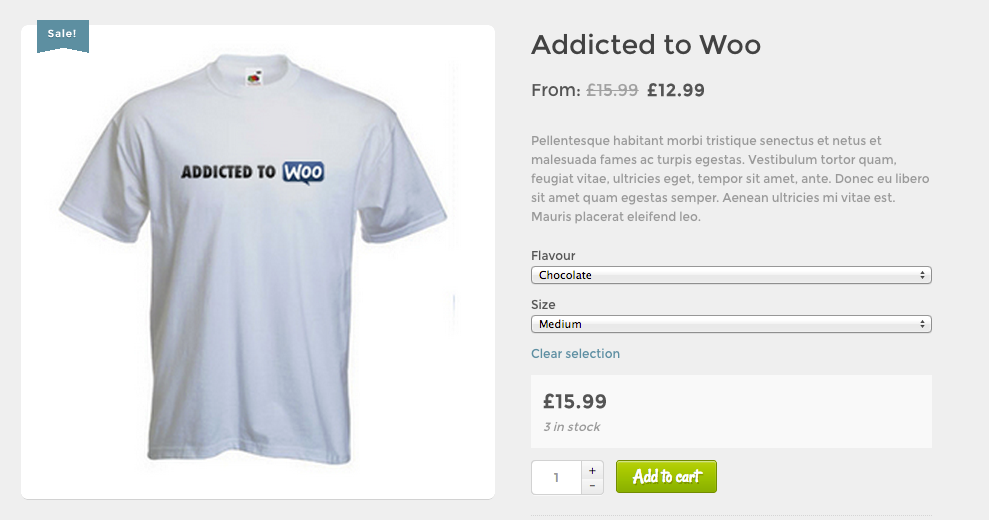
To create a clean design and ensure that the user continues along the correct path without missing essential steps, some actions can be hidden until relevant. For example, many e-commerce websites (such as the one below) hide the ‘add to cart’ button until all product options have been selected.
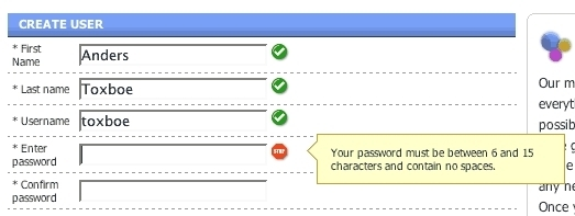
3. messages triggered by an error
Users filling out a form correctly will never see these, but they pop-up when an error has been made, such as entering mismatching passwords, adding an email address without an ‘@’ sign or leaving a required field empty. These feedback messages, which are specific to the mistake that has been made, can make the difference between a user successfully completing a sign-up or checkout process and dropping off.
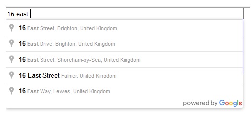
4. auto-complete text
Also making online form completion simpler, auto-complete text only appears after the user begins typing to reduce clutter. It then adds information automatically, thus making things quicker for users and reducing the risk of errors.
5. sticky navigation bars
The sticky navigation bar is a slim version of a website’s main navigation that follows and stays with the user as they scroll down the page. It allows them to navigate the site from any point without the need to scroll all the way back up to the top. A minimal design is usually used so that the bar doesn’t impose on the rest of the page as the user is reading.
6. ‘back to top’ buttons
‘Back to top’ buttons are simple alternatives to the sticky navigation bar. Usually placed in the bottom right corner when the page is quite long, they allow users to move back to the top of the page and continue their journey around the website with a single click. The button can include text or may be a minimalist upward arrow.
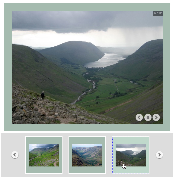
7. intuitive slideshow controls
Intuitive slideshow control features can include: navigation buttons (usually arrows); an auto-play button; options to zoom in or out; and even a menu showing thumbnails or slide numbers for reference. These usually appear only when the user hovers over the current image or slide, thus enabling them both to enjoy a full, unobstructed view of the image and to be able to interact or move on when needed.
in conclusion…
The features detailed above might be invisible, but including them in your web design makes a great difference to users and whether they have a pleasant and seamless experience browsing your site. They make simple design and reduced cognitive overload possible, whilst still retaining important functionality.
If you’d like help improving the UX of your website, please get in touch.


Recent Comments