header tail
browser compatibility for websites

browser compatibility for websites

browser compatibility for websites

home / Archives for December 2018

Today, there are a vast number of browsers, operating systems and device options – both modern and legacy – including Windows, Linux, Mac, Internet Explorer, Firefox, Chrome, Safari and Opera. Each browser or system translates and interprets your website code in order to display it, and each has its own method for doing so.

Find out how to ensure your website is cross-browser compatible…

what is browser compatibility?

Browser compatibility means that your website can be ‘translated’ effectively via a particular browser or operating system, such that it can be accessed by and is fully functional for a user. A site may behave perfectly in one browser but still have issues and errors in others. A good site is cross-browser compatible, such that it works on all, or the majority of, browsers (including any mobile/tablet versions), with consistent layout and features.

why is browser compatibility important?

If your site is incompatible with a particular browser, people using that browser will have a frustrating experience and may choose to exit before completing purchases or engaging with information. Such user experience problems can massively affect your bottom line – 88% of online consumers say they’re less likely to return to a site after a bad experience.

Even if your site is compatible with a particular browser or system now, it may not be compatible with future versions and upgrades of the browser/system.

how can you ensure browser compatibility?

Here are our top tips to ensure browser compatibility:

  1. Test, test, test: Schedule in regular testing to ensure your site always stays compatible, and plan time for additional testing whenever you make significant updates to your site. Make sure to test with as wide a range of browsers as possible, including both older and newer versions, and versions for different devices.
  2. Use tools: There are a vast number of browser compatibility testing tools. Free tools include Browserling, where you can test interactive versions of browsers one at a time, and Browser Shots, which offers screenshots of your site on multiple browsers simultaneously. Alternatively, for a more comprehensive overview of your site’s browser compatibility, try CrossBrowserTestingSauce Labs or BrowserStack.
  3. Prioritise with analytics: Find out how the majority of users access your site by checking Google Analytics (in Audience > Technology and Audience > Mobile) and make these browsers/systems your priority. For example, if most people are using Chrome on a desktop, then this should be your priority for browser design and testing.
  4. Keep it simple: Browser issues can often be remedied by simplifying your website code and removing anything unnecessary. This makes it easier for browsers to ‘translate’ the code accurately. But in case this doesn’t work, there are more detailed tips on overcoming browser compatibility issues in this blog.

If you’d like on-demand support with browser compatibility or enhancing the performance of your website in any other way, please get in touch.

the importance of regular content [infographic]

the importance of regular content [infographic]

the importance of regular content [infographic]

home / Archives for December 2018

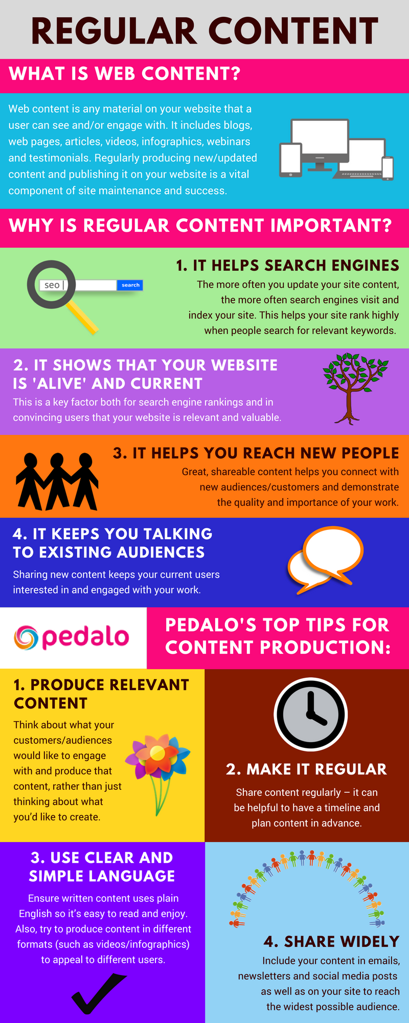
Web content is any material on your website that users can see or engage with, including web pages, blogs and videos. Our infographic covers everything you need to know about producing website content and explains why this is a critical component of web maintenance.

If you have any questions or would like us to check your site’s performance, please get in touch and we’ll be happy to help.

Regular-content-infographic by Pedalo

To sum up, producing regular, relevant content not only keeps your existing audience engaged, but also enables you to reach new people and enhance your company’s search engine profile – so it’s well worth the effort! For more guidance about producing great content, we highly recommend HubSpot Academy’s free content marketing certification course.

Would you prefer not to worry about content marketing or website maintenance? Please get in touch to find out how our cost-effective on-demand services can help you achieve digital success.

mobile responsivity: the basics

mobile responsivity: the basics

mobile responsivity: the basics

home / Archives for December 2018

We explain the basics of mobile responsivity and consider why you should ensure your site works on mobile and tablet devices…

what is mobile responsivity?

A responsive website reacts to its environment – whether it’s mobile, tablet or desktop – and changes the browsing experience to reflect the size and capabilities of that environment. It’s a bit like water changing shape when it’s poured from a jug into a glass or bowl. A responsive site has more or less the same functionality and content across all platforms, but appearance and layout may vary. For example, menus and buttons may look different and text/images may increase or decrease in size.

This is in contrast to a mobile (friendly) version of a website, which is a different, separate, version of a desktop site that has been created and designed specifically for mobile. It usually has a condensed menu and reduced functionality to make the site quicker to load. It may require content to be updated twice in the back end – on both the desktop and mobile versions of the site.

why is mobile responsivity important?

Mobile browsing accounts for more than half of internet traffic, having overtaken desktop browsing for the first time back in 2016. Mobile screens are much smaller than desktop ones, so a responsive or mobile-friendly website makes it easier for users to read and engage with content. It also affects search engine rankings, with Google increasingly prioritising mobile site versions in its algorithms, especially with its recent focus on mobile-first indexing. Maximising speed for mobile is vital too, as even a one second delay in page loading can result in 7% fewer conversions.

how can you check & improve your mobile site version?

Google has a free mobile test tool which checks whether or not your website is responsive/mobile-friendly and offers suggestions for improvements. The Responsive web design checker is also free and shows how your site looks on devices of different sizes.

If your website isn’t responsive and/or doesn’t have a mobile version, you may need to get a plugin or update your site’s code to improve responsivity. For WordPress, the free WPtouch plugin is recommended by Google; for Drupal, there’s detailed advice about responsivity for Drupal 7 and Drupal 8 on the Drupal.org website. Mobile speed and navigation can also be improved through simple changes such as making buttons larger and clearer, avoiding pop-ups, turning off background videos, replacing header menus with ‘hamburger’ versions, and compressing images.

Need help to optimise your website for mobile? Get in touch – we’d be delighted to chat to you.

SEO: the basics [infographic]

SEO: the basics [infographic]

SEO: the basics [infographic]

home / Archives for December 2018

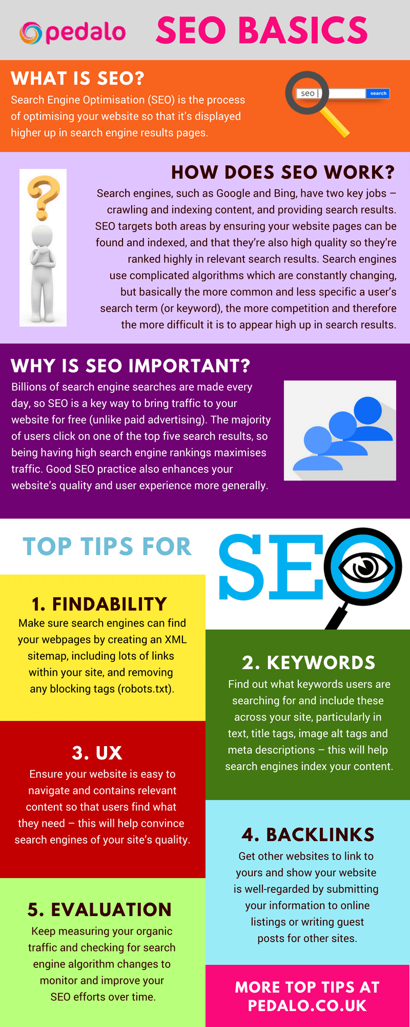
What is Search Engine Optimisation (SEO)? Most people know they need it to rank well on search engines. What they don’t know is what SEO does, how it works, and why it’s such an important component of website performance.

Here, we explain into the basics of SEO and offer five key tips to help you improve your search engine rankings…

SEO-infographic by Pedalo

SEO is a complex, specialist area so our infographic is just a brief introduction to the basics! Here are some more really great resources to further develop your understanding of SEO:

If you’d like assistance with SEO or enhancing the performance of your website in any other way, please get in touch and we’ll be happy to help. We offer expert, on-demand services where you only pay for what you need, when you need it. Give us a call on 020 8747 3274 to chat about your needs and requirements.